4 Bar Plots
Bar plots are commonly used to visualize the relative abundance of taxa or other features within different groups or conditions in microbiome data. In this section, we will demonstrate different methods for plotting bar plots.
4.1 Explore categorical variables
The freq() function is in the funModeling package provides a concise summary of the frequency distribution of a categorical variable in a dataset. It displays the count and percentage of each category, allowing users to quickly understand the distribution and prevalence of different categories within the variable. This function is useful for exploratory data analysis and understanding the composition of categorical variables in the dataset.
library(phyloseq)
library(dplyr)
library(microbiome)
library(funModeling)

df <-ps_df %>%
  select(-sample_id) %>%
  rename_all(tolower)

freq(df,
     input = c("sex", "nationality", "grp", "bmi"),
     plot = TRUE,
     na.rm = FALSE,
     # path_out="figures"
     )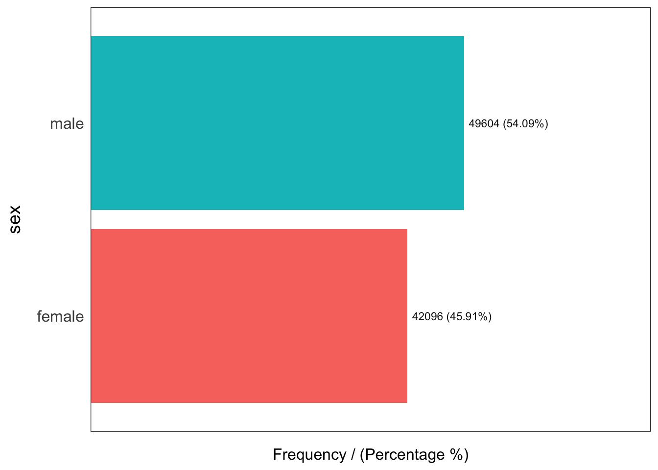
     sex frequency percentage cumulative_perc
1   male     49604      54.09           54.09
2 female     42096      45.91          100.00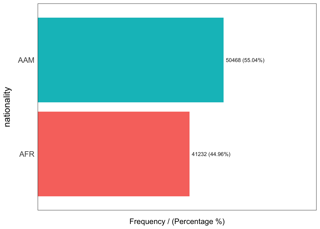
  nationality frequency percentage cumulative_perc
1         AAM     50468      55.04           55.04
2         AFR     41232      44.96          100.00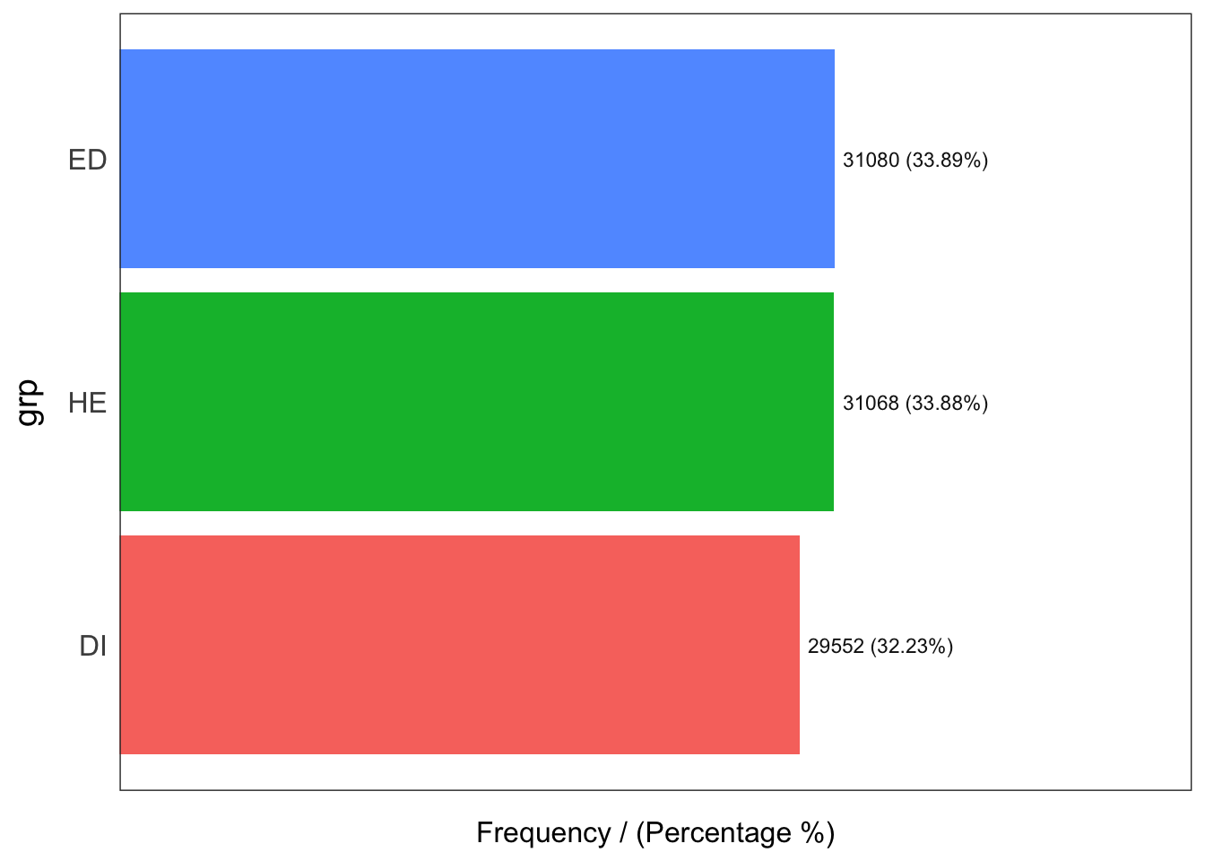
  grp frequency percentage cumulative_perc
1  ED     31080      33.89           33.89
2  HE     31068      33.88           67.77
3  DI     29552      32.23          100.00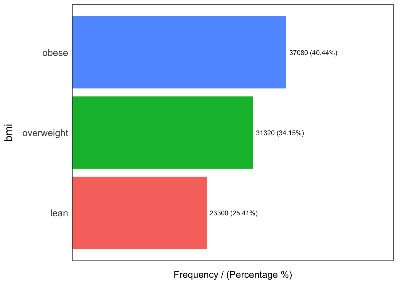
         bmi frequency percentage cumulative_perc
1      obese     37080      40.44           40.44
2 overweight     31320      34.15           74.59
3       lean     23300      25.41          100.00
[1] "Variables processed: sex, nationality, grp, bmi"
4.2 Comparative results from Mothur and QIIME2
# scripts/create_barplots.R
library(readr)
library(dplyr)
library(ggplot2)
library(svglite)

read_csv("../imap-data-preparation/data/mothur/mothur_composite.csv", show_col_types = FALSE) %>%
  mutate(pipeline="MOTHUR", .before=2) %>%
  select(-OTU, -3) %>%
  ggplot(aes(x=Genus, y=rel_abund, fill=pipeline)) +
  facet_grid(~pipeline) +
  geom_col() +
  coord_flip() +
  labs(y="Relative Abundance (%)") +
  theme(legend.position="none")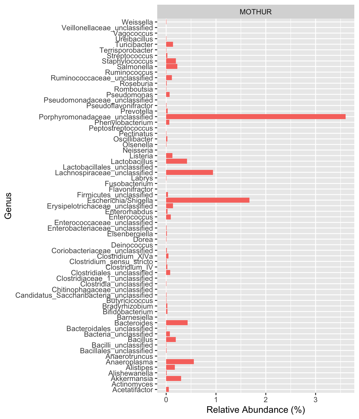
read_csv("../imap-data-preparation/data/qiime2/qiime2_composite.csv", show_col_types = FALSE) %>%
  mutate(pipeline="QIIME2", .before=2) %>%
  select(-feature, -c(3:14)) %>%
  ggplot(aes(x=Genus, y=rel_abund, fill=pipeline)) +
  facet_grid(~pipeline) +
  geom_col() +
  coord_flip() +
  labs(y="Relative Abundance (%)") +
  theme(legend.position="none")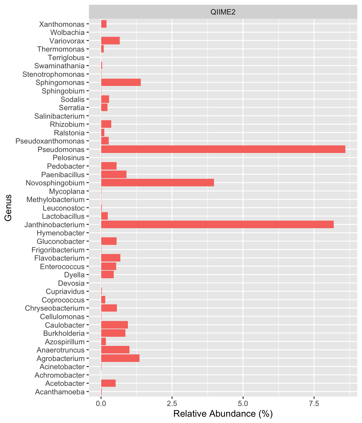
4.3 Compute sequence count per sample
Here we only show the head and tail count data
seqcount_per_sample <- ps_df %>%
  group_by(sample_id) %>%
  summarise(nseqs = sum(count), .groups = "drop") %>%
  arrange(-nseqs)

head_tail <- rbind(head(seqcount_per_sample, 5), tail(seqcount_per_sample, 5))

max_y <- max(head_tail$nseqs)

head_tail %>%
  mutate(sample_id = factor(sample_id),
         sample_id = fct_reorder(sample_id, nseqs, .desc = F),
         sample_id = fct_shift(sample_id, n = 0)) %>%
  ggplot(aes(x = reorder(sample_id, nseqs), y = nseqs)) +
  geom_col(position = position_stack(), fill = "steelblue") +
  labs(x = "sample ID", y = "Number of sequences", subtitle = "Phylum: Top and bottom sequence count \nwith no data labels") +
  theme_classic() +
  theme(axis.text.x = element_text(angle = 45, hjust = 1, size = 8))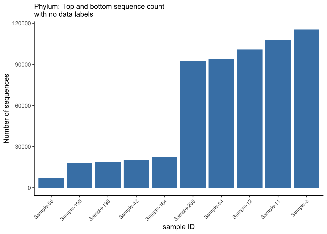
ggsave("figures/basic_barplot.png", width=5, height=4)


#---------------------------------------


head_tail %>%
  mutate(sample_id = factor(sample_id),
         sample_id = fct_reorder(sample_id, nseqs, .desc = F),
         sample_id = fct_shift(sample_id, n = 0)) %>%
  ggplot(aes(x = reorder(sample_id, nseqs), y = nseqs)) +
  geom_col(position = position_stack(), fill = "steelblue") +
  labs(x = "sample ID", y = "Number of sequences", subtitle = "Phylum: Top and bottom sequence count \nwith data labels") +
  theme_classic() +
  theme(axis.text.x = element_text(angle = 45, hjust = 1, size = 8)) +
  coord_cartesian(ylim = c(0, max_y)) +
  geom_text(aes(label = nseqs), vjust = -0.3, color = "#AAAAAA")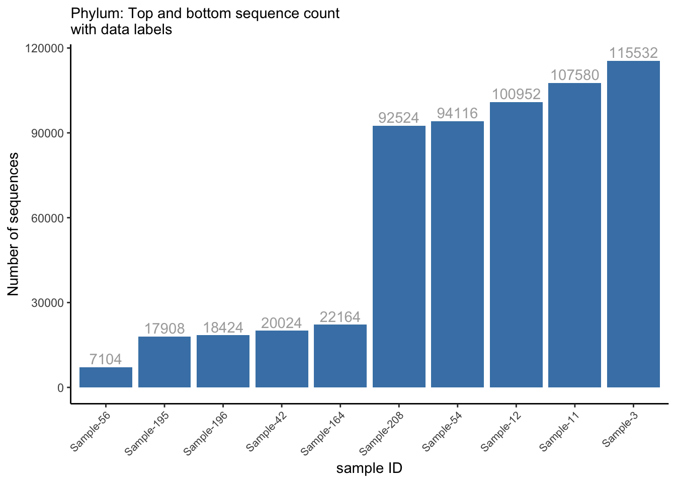
ggsave("figures/barplot_w_labels.png", width=5, height=4)4.4 Relative abundance of taxa
The comp_barplot function in the microViz R package is designed to create comparative bar plots for visualizing microbiome data. This function allows users to compare the relative abundance of taxa or other features across different groups or conditions. It supports customization options such as color palette selection and plot title specification to enhance the appearance of the bar plot.
library(microViz)

psextra_raw %>%
  comp_barplot(
    tax_level = "Genus", n_taxa = 15, other_name = "Other",
    taxon_renamer = function(x) stringr::str_remove(x, " [ae]t rel."),
    palette = distinct_palette(n = 15, add = "grey90"),
    merge_other = FALSE, bar_outline_colour = "darkgrey"
  ) +
  coord_flip() +
  facet_wrap("nationality", nrow = 1, scales = "free") +
  labs(x = NULL, y = NULL) +
  theme(axis.text.y = element_blank(), axis.ticks.y = element_blank())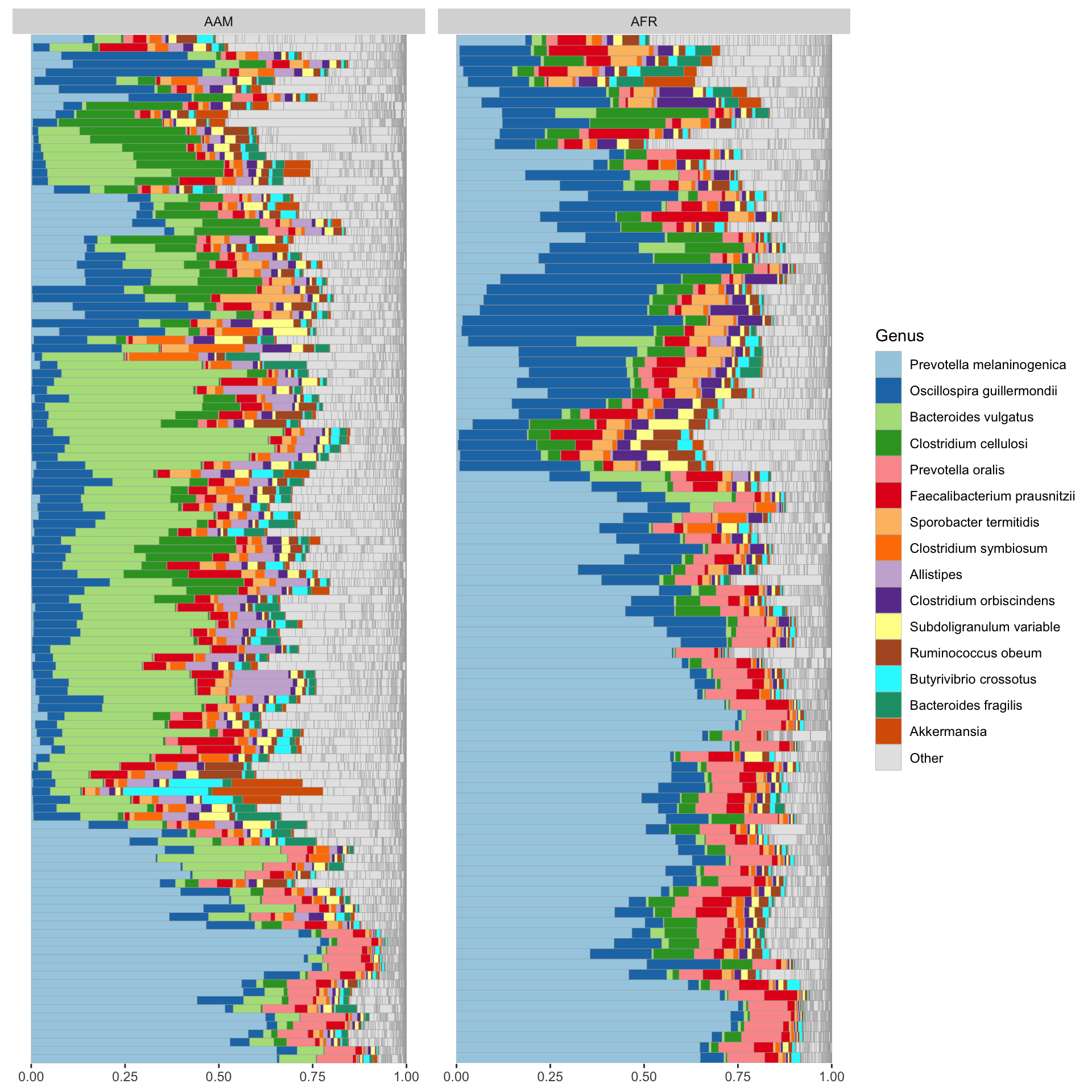
4.5 Bar plot on ps_caporaso dataset
library(microViz)

ps_caporaso %>%
  tax_fix() %>%
  comp_barplot(
    tax_level = "Genus", n_taxa = 15, other_name = "Other",
    taxon_renamer = function(x) stringr::str_remove(x, " [ae]t rel."),
    palette = distinct_palette(n = 15, add = "grey90"),
    merge_other = FALSE, bar_outline_colour = "darkgrey"
  ) +
  coord_flip() +
  # facet_wrap("SampleType", nrow = 1, scales = "free") +
  labs(x = NULL, y = NULL) +
  theme(axis.text.y = element_blank(), axis.ticks.y = element_blank())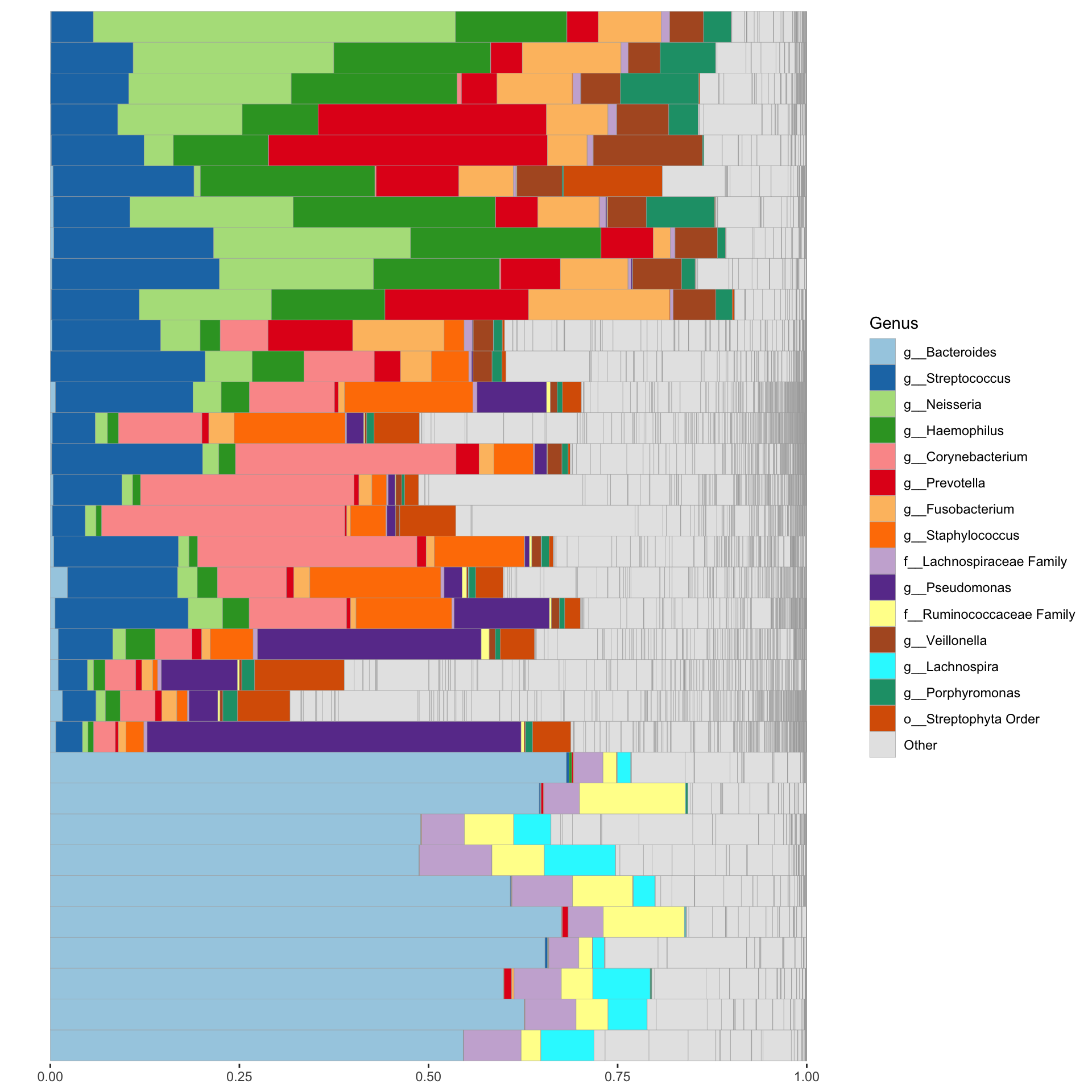
4.6 Bar plots for Taxa relative abundane
set.seed(1234)
library(tidyverse)
library(readxl)
library(ggtext)
library(RColorBrewer)


otu_rel_abund <- ps_df %>%
  mutate(nationality = factor(nationality,
                      levels = c("AAM", "AFR"),
                      labels = c("African American", "African")),
         bmi = factor(bmi,
                      levels = c("lean", "overweight", "obese"),
                      labels = c("Lean", "Overweight", "Obese")),
         sex = factor(sex,
                      levels =c("female", "male"),
                      labels = c("Female", "Male")))

save(otu_rel_abund, file = "data/otu_rel_abund.rda")

phylum_rel_abund <- otu_rel_abund %>%
  filter(level=="phylum",
         !grepl(".*unassigned.*|.*nclassified.*|.*ncultured.*",taxon)) %>%
  group_by(bmi, sample_id, taxon) %>%
  summarise(rel_abund = sum(rel_abund), .groups="drop") %>%
  group_by(bmi, taxon) %>%
  summarise(mean_rel_abund = 100*mean(rel_abund), .groups="drop") %>%
  mutate(taxon = str_replace(taxon, "(.*)_unclassified", "Unclassified<br>*\\1*"),
         taxon = str_replace(taxon, "^$", "*\\1*"),
         taxon = str_replace(taxon, "_", " "))

## Pool low abundance to "Others"
taxon_pool <- phylum_rel_abund %>%
  group_by(taxon) %>%
  summarise(pool = max(mean_rel_abund) < 1,
            mean = mean(mean_rel_abund), .groups="drop")


inner_join(phylum_rel_abund, taxon_pool, by="taxon") %>%
  mutate(taxon = if_else(pool, "Other", taxon)) %>%
  group_by(bmi, taxon) %>%
  summarise(mean_rel_abund = sum(mean_rel_abund),
            mean = min(mean), .groups="drop") %>%
  mutate(taxon = factor(taxon),
         taxon = fct_reorder(taxon, mean, .desc=TRUE),
         taxon = fct_shift(taxon, n=1)) %>%
  ggplot(aes(x=bmi, y=mean_rel_abund, fill=taxon)) +
  geom_col(position = position_stack()) +
  scale_fill_discrete(name=NULL) +
  scale_x_discrete(breaks = c("lean", "overweight", "obese"), labels = c("Lean", "Overweight", "Obese")) +
  scale_fill_manual(name=NULL,
                    breaks=c("*Actinobacteria*","*Bacteroidetes*", "*Cyanobacteria*", "*Firmicutes*","*Proteobacteria*", "Other"),
                    labels = c("Actinobacteria","Bacteroidetes", "Cyanobacteria", "Firmicutes", "Proteobacteria", "Other"),
                    values = c(brewer.pal(5, "Dark2"), "gray")) +
  labs(x = NULL, y = "Mean Relative Abundance", subtitle = "Phyla stacked bars filled by taxon") +
  theme_classic() +
  theme(axis.text.x = element_markdown(),
        legend.text = element_markdown(),
        legend.key.size = unit(10, "pt"))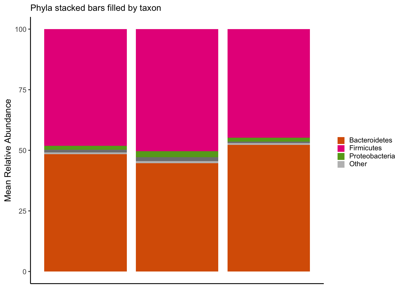
ggsave("figures/stacked_phyla.png", width=5, height=4)
#---------------------------------------

taxon_rel_abund <- otu_rel_abund %>%
  filter(level=="genus",
         !grepl(".*unassigned.*|.*nclassified.*|.*ncultured.*",taxon)) %>%
  group_by(bmi, sample_id, taxon) %>%
  summarise(rel_abund = sum(rel_abund), .groups="drop") %>%
  group_by(bmi, taxon) %>%
  summarise(mean_rel_abund = 100*mean(rel_abund), .groups="drop") %>%
  mutate(taxon = str_replace(taxon, "(.*)_unclassified", "Unclassified<br>*\\1*"),
         taxon = str_replace(taxon, "^$", "*\\1*"),
         taxon = str_replace(taxon, "_", " "))

#---------------------------------------

## Pool low abundance to "Others"

taxon_pool <- taxon_rel_abund %>%
  group_by(taxon) %>%
  summarise(pool = max(mean_rel_abund) < 2,
            mean = mean(mean_rel_abund), .groups="drop")


inner_join(taxon_rel_abund, taxon_pool, by="taxon") %>%
  mutate(taxon = if_else(pool, "Other", taxon)) %>%
  group_by(bmi, taxon) %>%
  summarise(mean_rel_abund = sum(mean_rel_abund),
            mean = min(mean), .groups="drop") %>%
  mutate(taxon = factor(taxon),
         taxon = fct_reorder(taxon, mean, .desc=TRUE),
         taxon = fct_shift(taxon, n=1)) %>%
  ggplot(aes(x=bmi, y=mean_rel_abund, fill=taxon)) +
  geom_col(position = position_stack()) +
  scale_fill_discrete(name=NULL) +
  scale_x_discrete(breaks = c("lean", "overweight", "obese"), labels = c("Lean", "Overweight", "Obese")) +
  labs(x = NULL, y = "Mean Relative Abundance", subtitle = "Taxa stacked bars filled by taxon") +
  theme_classic() +
  theme(axis.text.x = element_markdown(),
        legend.text = element_markdown(),
        legend.key.size = unit(10, "pt"))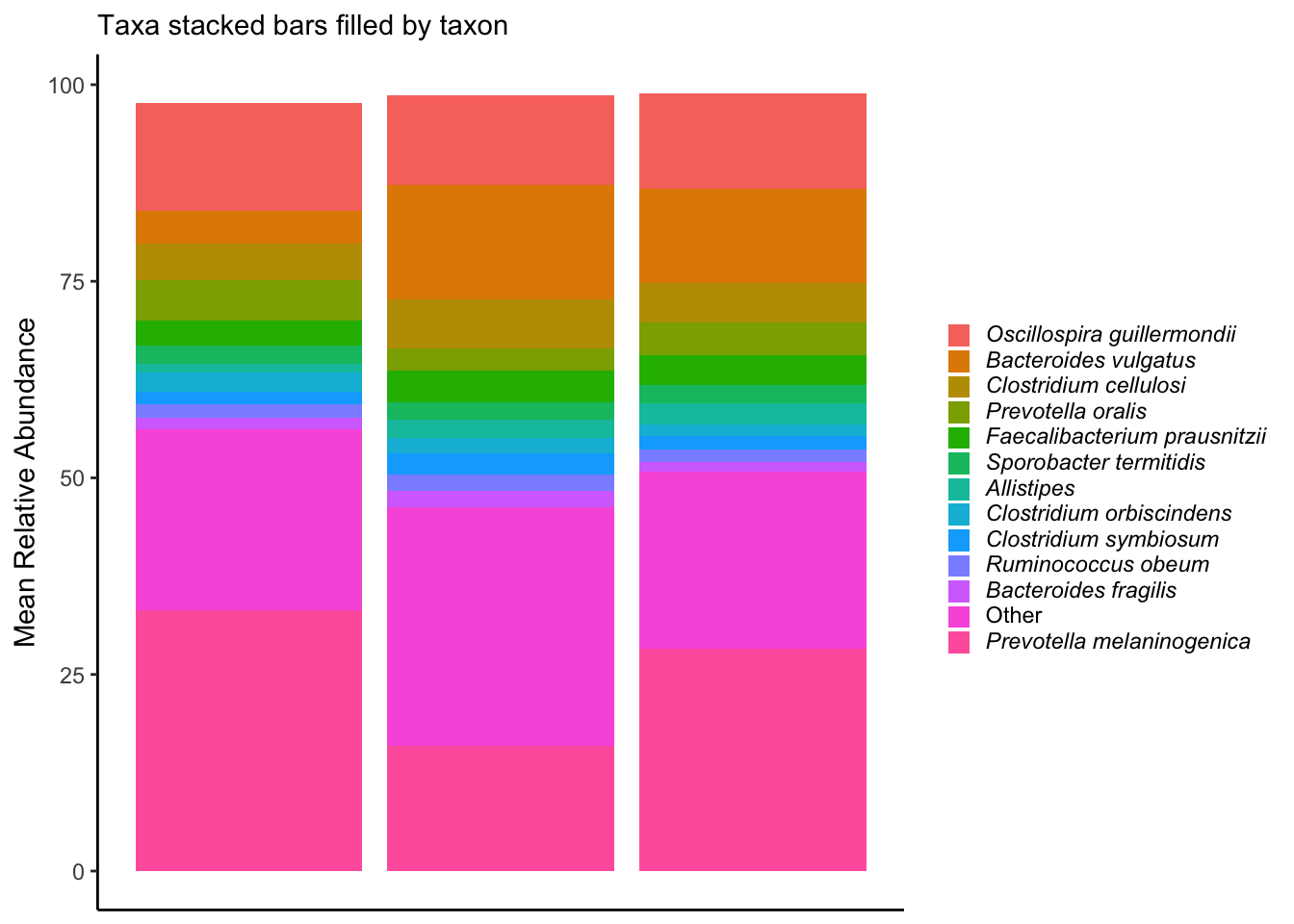
ggsave("figures/stacked_taxa.png", width=5, height=4)

#---------------------------------------

phylum_rel_abund <- otu_rel_abund %>%
  filter(level=="phylum",
         !grepl(".*unassigned.*|.*nclassified.*|.*ncultured.*",taxon)) %>%
  group_by(bmi, sample_id, taxon) %>%
  summarise(rel_abund = sum(rel_abund), .groups="drop") %>%
  group_by(bmi, taxon) %>%
  summarise(mean_rel_abund = 100*mean(rel_abund), .groups="drop") %>%
  mutate(taxon = str_replace(taxon, "(.*)_unclassified", "Unclassified<br>*\\1*"),
         taxon = str_replace(taxon, "^$", "*\\1*"),
         taxon = str_replace(taxon, "_", " "))

## Pool low abundance to "Others"
taxon_pool <- phylum_rel_abund %>%
  group_by(taxon) %>%
  summarise(pool = max(mean_rel_abund) < 1,
            mean = mean(mean_rel_abund), .groups="drop")


inner_join(phylum_rel_abund, taxon_pool, by="taxon") %>%
  mutate(taxon = if_else(pool, "Other", taxon)) %>%
  group_by(bmi, taxon) %>%
  summarise(mean_rel_abund = sum(mean_rel_abund),
            mean = min(mean), .groups="drop") %>%
  mutate(taxon = factor(taxon),
         taxon = fct_reorder(taxon, mean, .desc=TRUE),
         taxon = fct_shift(taxon, n=1)) %>%
  ggplot(aes(y=taxon, x = mean_rel_abund, fill= bmi)) +
  geom_col(width=0.8, position = position_dodge()) +
  labs(y = NULL, x = "Mean Relative Abundance", subtitle = "Phyla grouped by BMI category", fill = NULL) +
  theme_classic() +
  theme(axis.text.x = element_markdown(angle = 0, hjust = 1, vjust = 1),
        axis.text.y = element_markdown(),
        legend.text = element_markdown(),
        legend.key.size = unit(12, "pt"),
        panel.background = element_blank(),
        # panel.grid.major.x =  element_line(colour = "lightgray", size = 0.1),
        panel.border = element_blank()) +
  guides(fill = guide_legend(ncol=1)) +
  scale_x_continuous(expand = c(0, 0))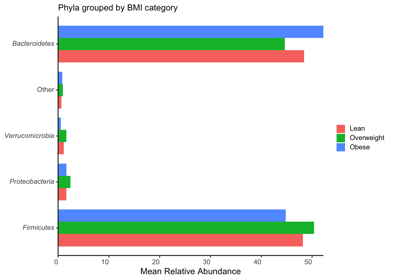
ggsave("figures/grouped_phyla.png", width=5, height=4)
#---------------------------------------

taxon_rel_abund <- otu_rel_abund %>%
  filter(level=="genus",
         !grepl(".*unassigned.*|.*nclassified.*|.*ncultured.*",taxon)) %>%
  group_by(bmi, sample_id, taxon) %>%
  summarise(rel_abund = sum(rel_abund), .groups="drop") %>%
  group_by(bmi, taxon) %>%
  summarise(mean_rel_abund = 100*mean(rel_abund), .groups="drop") %>%
  mutate(taxon = str_replace(taxon, "(.*)_unclassified", "Unclassified<br>*\\1*"),
         taxon = str_replace(taxon, "^$", "*\\1*"),
         taxon = str_replace(taxon, "_", " "))

## Pool low abundance to "Others"

taxon_pool <- taxon_rel_abund %>%
  group_by(taxon) %>%
  summarise(pool = max(mean_rel_abund) < 2,
            mean = mean(mean_rel_abund), .groups="drop")

## Plotting
inner_join(taxon_rel_abund, taxon_pool, by="taxon") %>%
  mutate(taxon = if_else(pool, "Other", taxon)) %>%
  group_by(bmi, taxon) %>%
  summarise(mean_rel_abund = sum(mean_rel_abund),
            mean = min(mean), .groups="drop") %>%
  mutate(taxon = factor(taxon),
         taxon = fct_reorder(taxon, mean, .desc=TRUE),
         taxon = fct_shift(taxon, n=1)) %>%
  ggplot(aes(y=taxon, x = mean_rel_abund, fill= bmi)) +
  geom_col(width=0.8, position = position_dodge()) +
  labs(y = NULL, x = "Mean Relative Abundance", subtitle = "Taxa grouped by BMI category", fill = NULL) +
  theme_classic() +
  theme(axis.text.x = element_markdown(angle = 0, hjust = 1, vjust = 1),
        axis.text.y = element_markdown(),
        legend.text = element_markdown(),
        legend.key.size = unit(12, "pt"),
        panel.background = element_blank(),
        # panel.grid.major.x =  element_line(colour = "lightgray", size = 0.1),
        panel.border = element_blank()) +
  guides(fill = guide_legend(ncol=1)) +
  scale_x_continuous(expand = c(0, 0))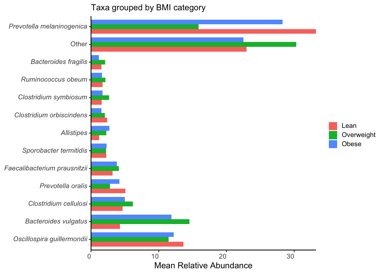
ggsave("figures/grouped_taxa.png", width=5, height=4)
#---------------------------------------

phylum <- ps_df %>%
  filter(level == "phylum")

phylum_pool <- phylum %>%
  group_by(taxon) %>%
  summarise(pool = max(rel_abund) < 0.02,
            mean = mean(rel_abund), .groups="drop")

inner_join(phylum, phylum_pool, by="taxon") %>%
  mutate(taxon = if_else(pool, "Other", taxon)) %>%
  ggplot(aes(x = sample_id, y = 100*rel_abund, fill = taxon)) +
  theme_bw() +
  geom_bar(stat = "identity", position = position_stack()) +
  labs(x="Sample", y="Relative Abundance", subtitle = "Taxa Relative Abundance faceted by group", fill = NULL) +
  facet_grid(~ nationality, space = "free", scales = "free") +
  theme(axis.text.x = element_blank(),
        legend.text = element_markdown(),
        strip.background = element_rect(colour = "lightblue", fill = "lightblue")) +
  scale_fill_manual(name=NULL,
                    breaks=c("*Actinobacteria*","*Bacteroidetes*", "*Firmicutes*","*Proteobacteria*", "*Verrucomicrobia*", "Other"),
                    labels=c("*Actinobacteria*","*Bacteroidetes*", "*Firmicutes*","*Proteobacteria*", "*Verrucomicrobia*", "Other"),
                    values = c(brewer.pal(5, "Paired"), "gray"))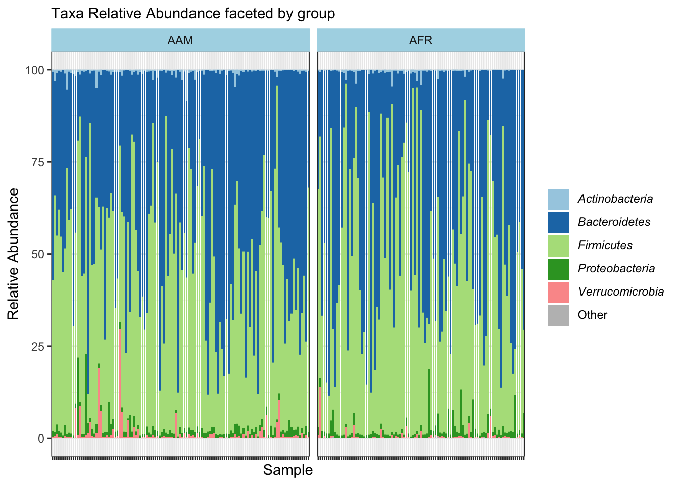
ggsave("figures/faceted_phyla_bar.png", width=5, height=4)
#---------------------------------------

genus <-  ps_df %>%
  filter(level == "genus")

genus_pool <- genus %>%
  group_by(taxon) %>%
  summarise(pool = max(rel_abund) < 0.15,
            mean = mean(rel_abund), .groups="drop")

inner_join(genus, genus_pool, by="taxon") %>%
  mutate(taxon = if_else(pool, "Other", taxon)) %>%
  ggplot(aes(x = sample_id, y = 100*rel_abund, fill = taxon)) +
  theme_bw() +
  geom_bar(stat = "identity", position = position_stack()) +
  labs(x="Sample", y="Relative Abundance", subtitle = "Taxa Relative Abundance faceted by group", fill = NULL) +
  facet_grid(~ nationality, space = "free", scales = "free") +
  theme(axis.text.x = element_blank(),
        legend.text = element_markdown(),
        strip.background = element_rect(colour = "lightblue", fill = "lightblue"))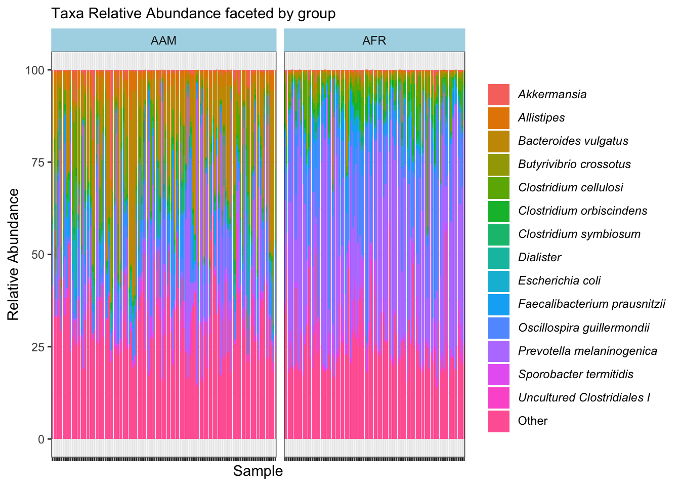
ggsave("figures/faceted_taxa_bar.png", width=5, height=4)
#---------------------------------------

ps_rel %>%
microbial::plotbar( level="Phylum", group = "nationality", top = 10) +
  theme(axis.text.x = element_text(angle = 0)) +
  labs(x="Sample",
       y="Relative Abundance",
       subtitle = "Phyla Relative Abundance by plotbar()\nin microbial package",
       fill = NULL)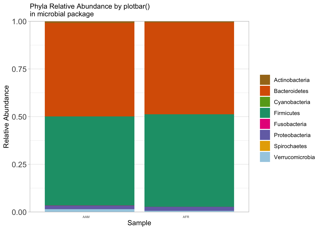
ggsave("figures/plotbar_phyla_bar.png", width=5, height=4)

#---------------------------------------

ps_rel %>%
microbial::plotbar(level="Genus", group = "nationality", top = 10) +
  theme(axis.text.x = element_text(angle = 0)) +
  labs(x="Sample",
       y="Relative Abundance",
       subtitle = "Taxa Relative Abundance by plotbar()\nin microbial package",
       fill = NULL)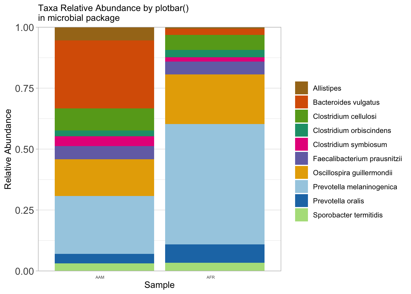
ggsave("figures/plotbar_taxa_bar.png", width=5, height=4)
#---------------------------------------
# Using ggpubr package
#---------------------------------------

library(ggpubr)
library(RColorBrewer)
library(viridis)

psmelt(ps_rel) %>%
  select(Sample, nationality, Phylum, Abundance) %>%
  group_by(Sample, nationality, Phylum) %>%
  summarise(Abundance = sum(Abundance), .groups = "drop") %>%
  filter(Abundance > 0.01) %>%
  mutate(Phylum = fct_reorder(Phylum, -Abundance)) %>%
  ggbarplot(x = "Phylum", y = "Abundance",
            fill = "nationality",
            color = "nationality",
            palette = "jco",
            sort.by.groups = FALSE,
            rotate = TRUE,
            position = position_dodge()) +
  theme_classic() +
  theme(axis.text.x = element_markdown(angle = 0, hjust = 1, vjust = 1),
        axis.text.y = element_markdown(),
        legend.text = element_markdown(),
        legend.key.size = unit(12, "pt"))  +
  labs(x=NULL,
       y="Relative Abundance (%)",
       subtitle = "Phyla Relative Abundance by ggbarplot()\nin ggpubr package grouped by nationality",
       fill = NULL) +
  guides(color = "none")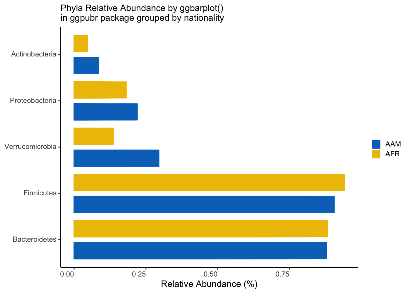
ggsave("figures/ggpubr_phyla_bar.png", width=5, height=4)
#------------------------------
# Plot top n
#------------------------------
library(phyloseq)
library(tidyverse)
library(ggpubr)

df <- psmelt(ps_rel) %>%
  select(Sample, nationality, Genus, Abundance) %>%
  group_by(Sample, nationality, Genus) %>%
  summarise(Abundance = sum(Abundance), .groups = "drop")

# Function
top_n_unique <- function(df, n, group_var, value_var) {
  df %>%
    group_by({{ group_var }}) %>%
    mutate(rank = dense_rank(desc({{ value_var }}))) %>%
    filter(rank <= n) %>%
    ungroup() %>%
    select(-rank)
}

# Plot
n <- 10  # Number of top unique taxa to select
top_n_unique(df, n, Genus, Abundance) %>%
  filter(Abundance > 0.2) %>%
  mutate(Genus = fct_reorder(Genus, -Abundance)) %>%
  ggbarplot(x = "Genus", y = "Abundance",
            fill = "nationality",
            color = "nationality",
            palette = "jco",
            sort.by.groups = FALSE,
            rotate = TRUE,
            position = position_dodge()) +
  theme_classic() +
  theme(axis.text.x = element_markdown(angle = 0, hjust = 1, vjust = 1),
        axis.text.y = element_markdown(),
        legend.text = element_markdown(),
        legend.key.size = unit(12, "pt"))  +
  labs(x=NULL,
       y="Relative Abundance (%)",
       subtitle = "Genera Relative Abundance by ggbarplot()\nin ggpubr package grouped by nationality",
       fill = NULL) +
  guides(color = "none")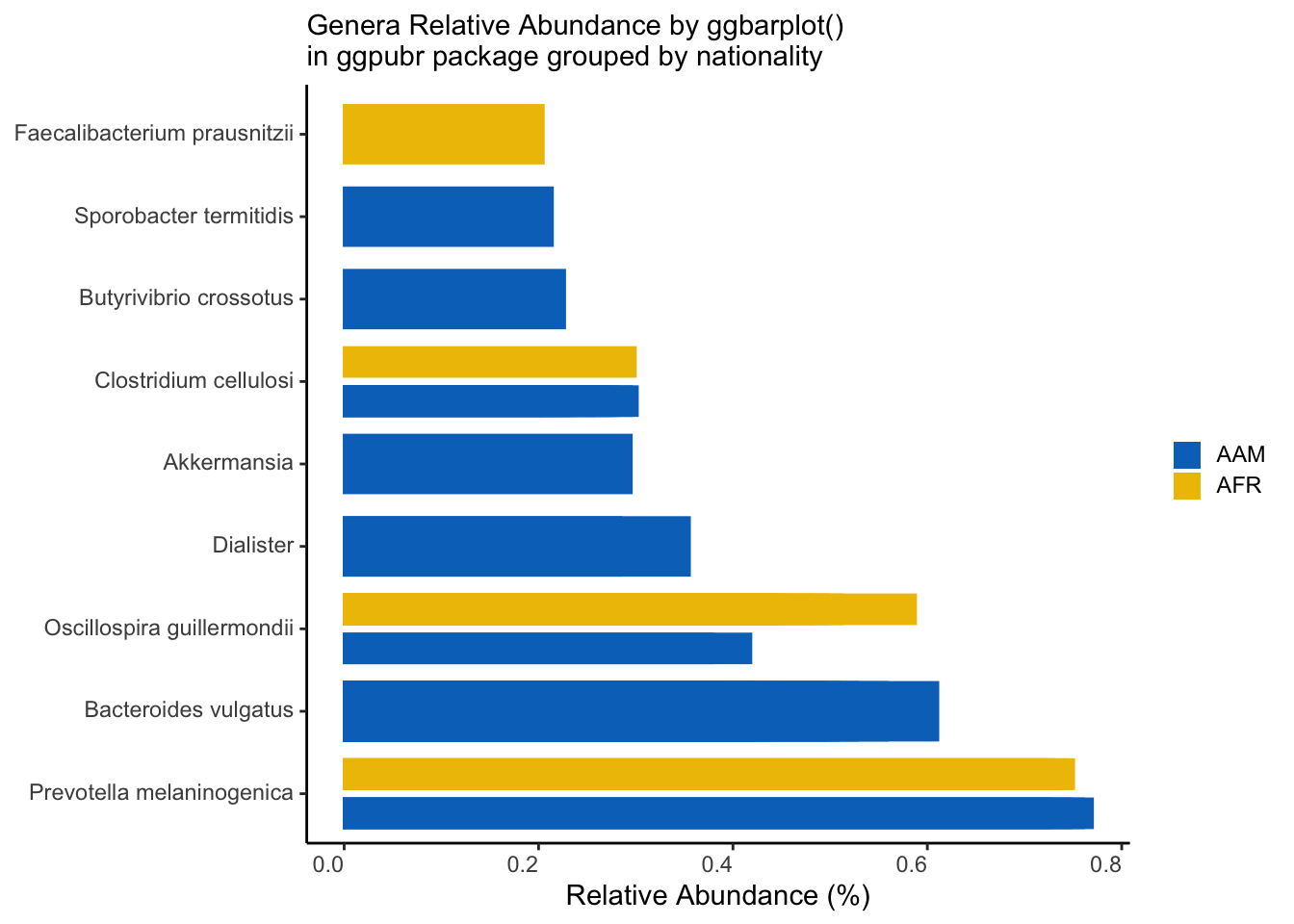
ggsave("figures/ggpubr_top_n_bar.png", width=5, height=4)